Amphora
Brand Concept - 2026
Amphora is a brand concept for a high phenolic extra virgin olive oil brand. It was a response to the design challenge "To define a visual identity that renews an established product for a modern consumer and rediscovers its significance". My research revealed a problem; that for a product with such a special significance in human history, it is generally an undervalued; an afterthought in the kitchen.
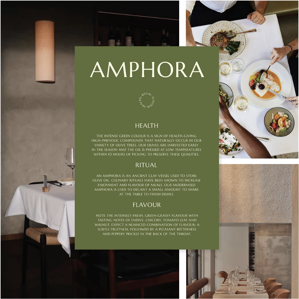
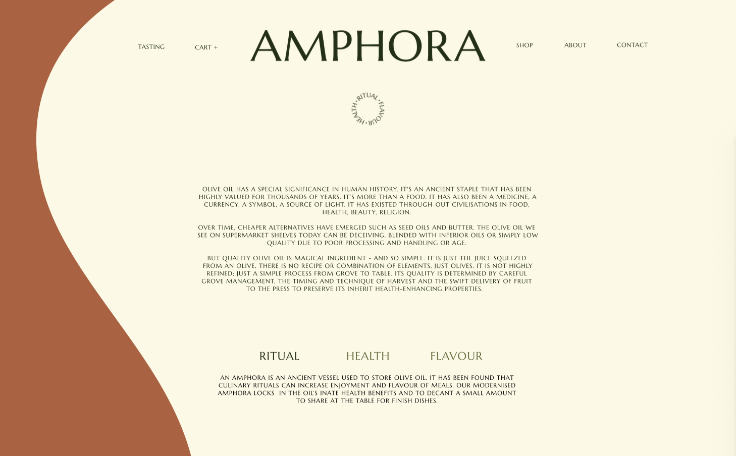
My approach for renewing this ancient staple was by highlighting the product's undeniable significance and potential, represented by three brand pillars: health, ritual and flavour.
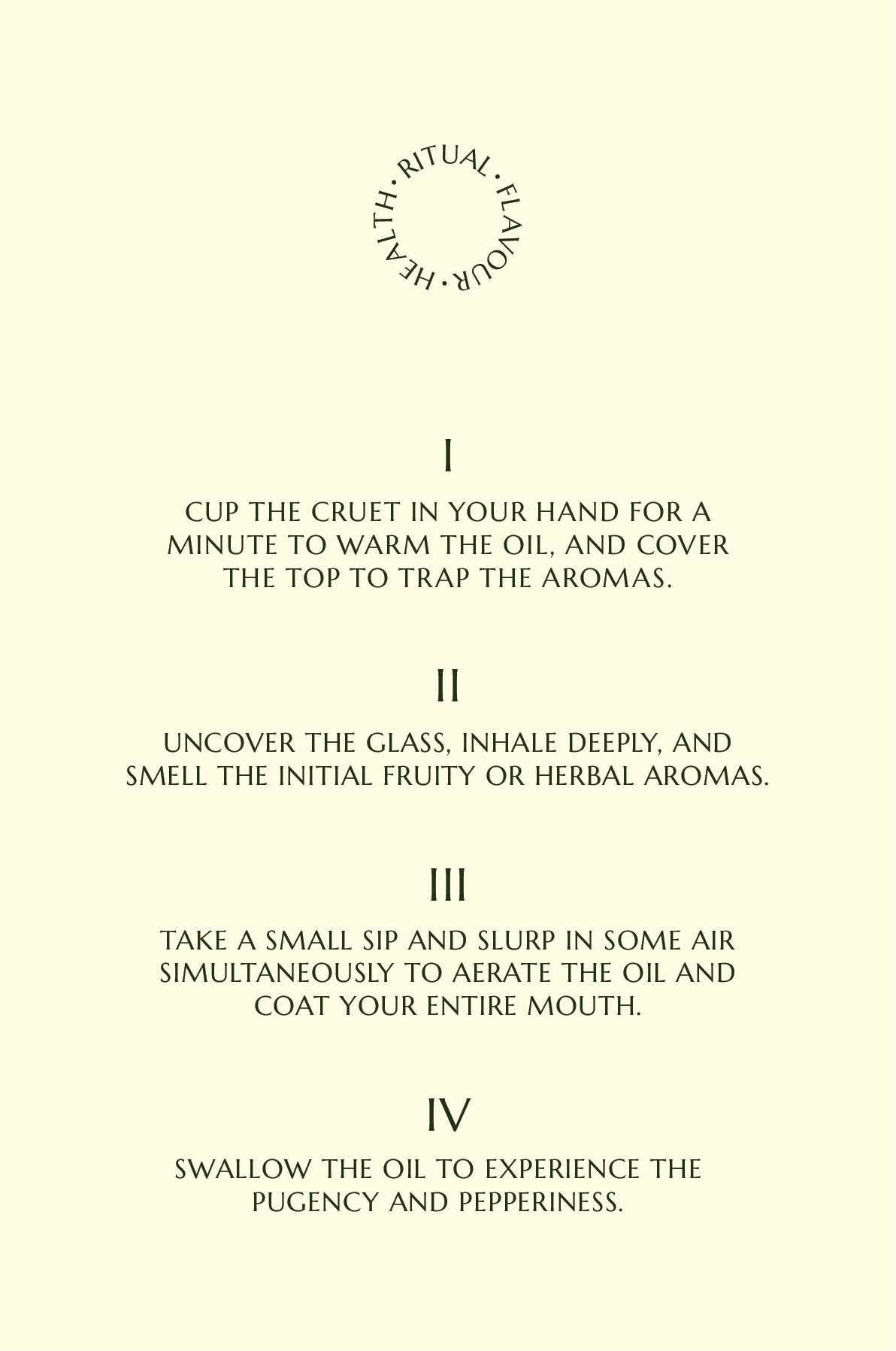
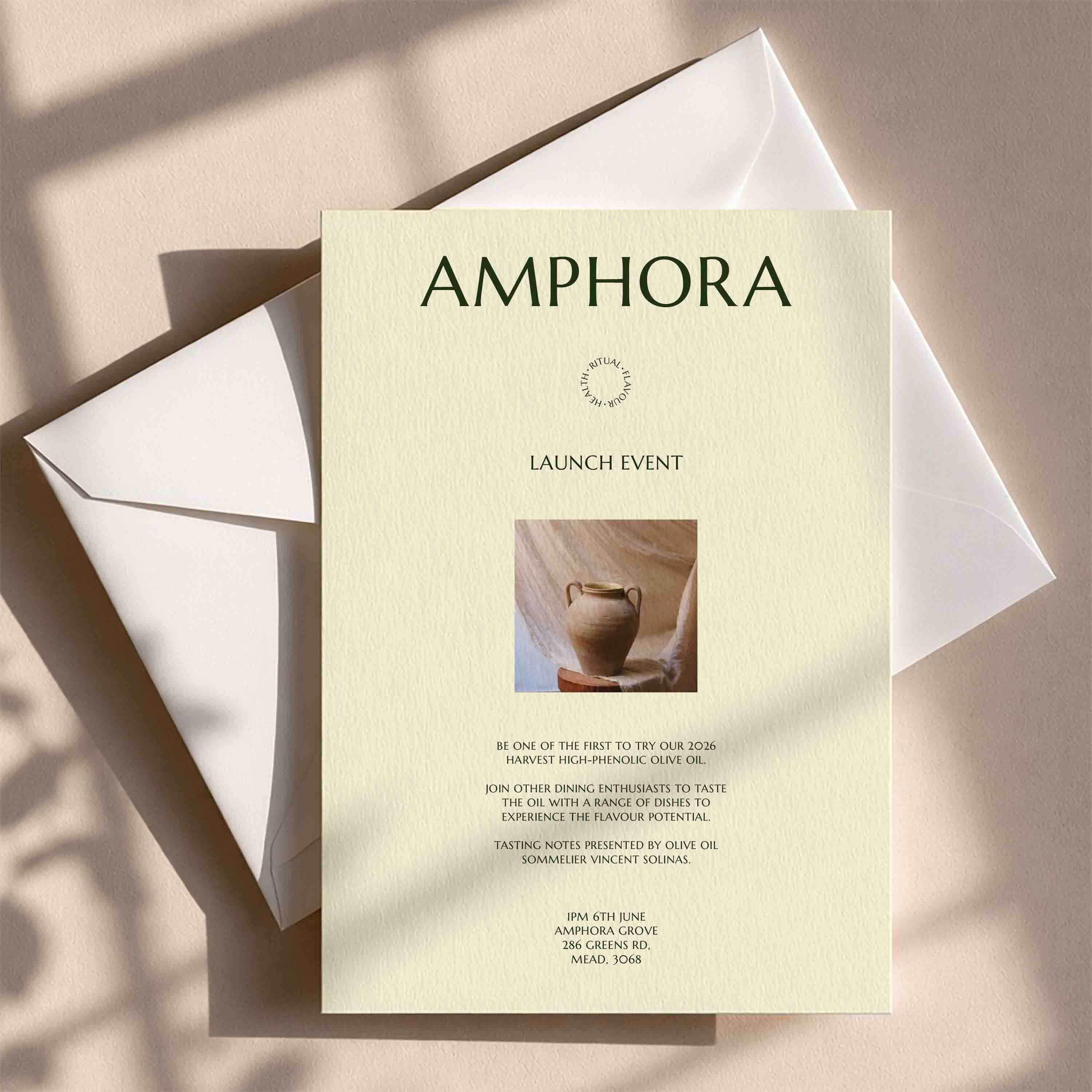
The bag-in-box packaging merges practicality with design, acting as a modernised amphora that can sit in a kitchen or dining room. Consumers can decant the oil fresh into their handmade terracotta pouring vessel for use. This incorporates ritual into the packaging design by transforming the product's use into an experience.
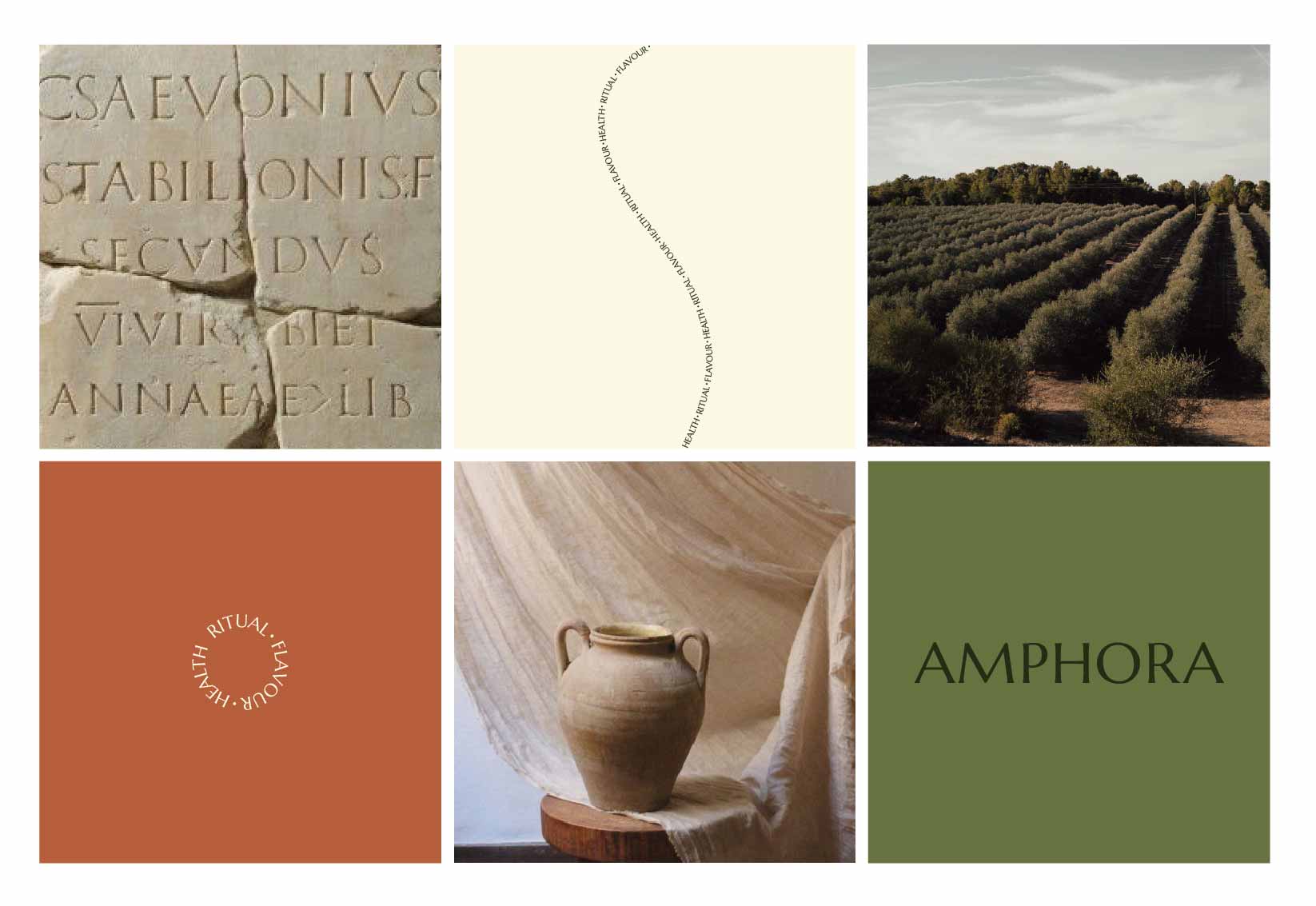
The typography references olive oil's history, inspired by capitalis monumentalis and producing a wordmark with a strong historical connection. Interpuncts are used in the stamps and roman numerals are used where possible. The semi-amphora shape was developed to adapt to any brand deliverable.
This resulted in a brand that renews olive oil for the modern consumer and recalls its significance by structurally embodying its history, health benefits, flavour and roots in ritualism.
.
.